
Emily Strobehn ★
★ Found (1) GRAPHIC DESIGNER and ILLUSTRATOR 9999 miles and 3 universes away from you!
My Work ★
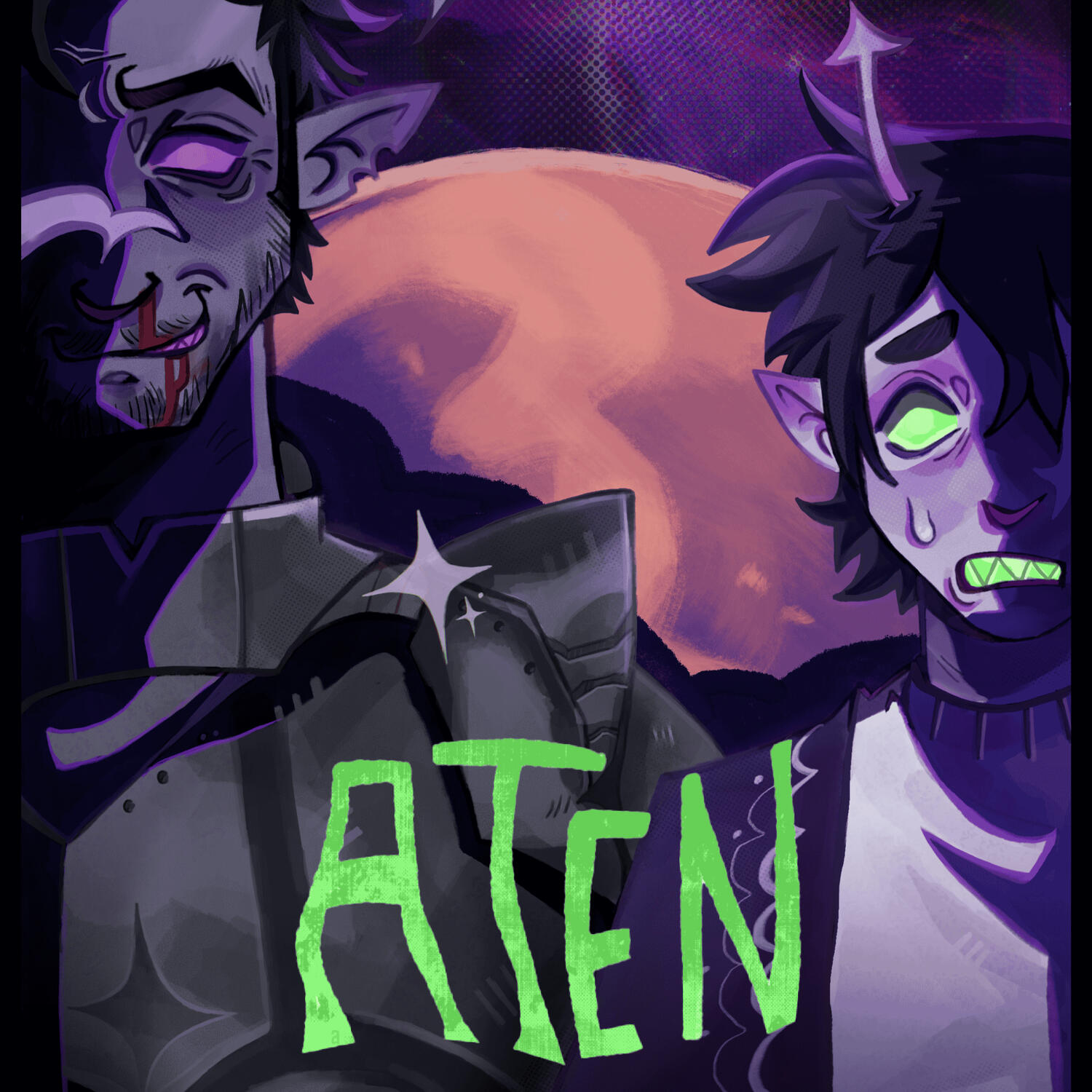
Aten - Movie Poster
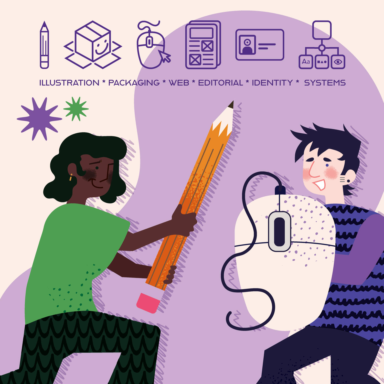
Types of Design - Identity
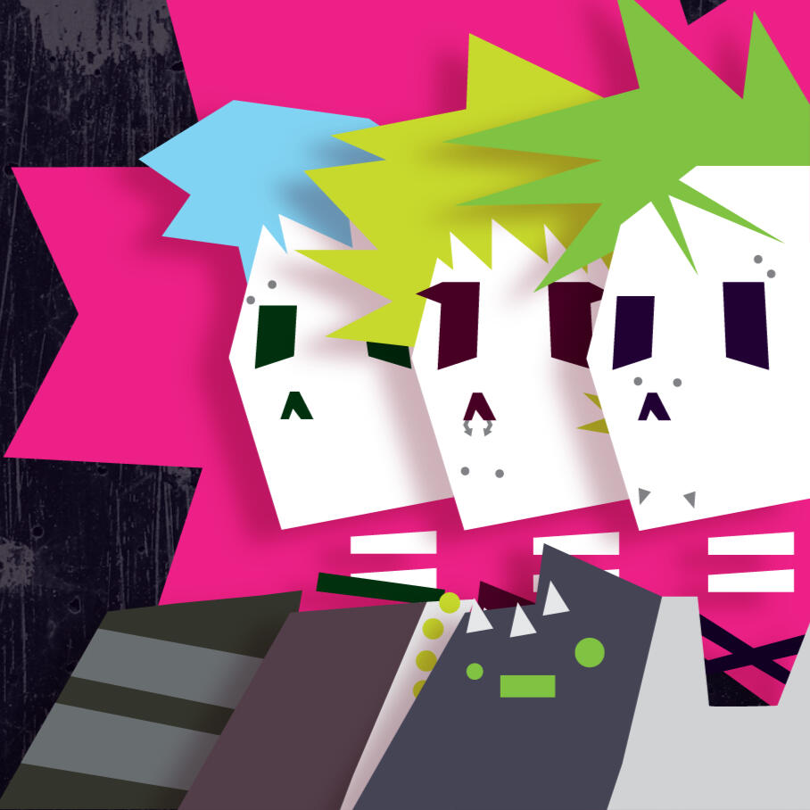
Punk Rocks - Packaging
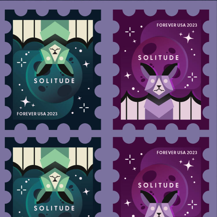
Bat Stamps - Illustration
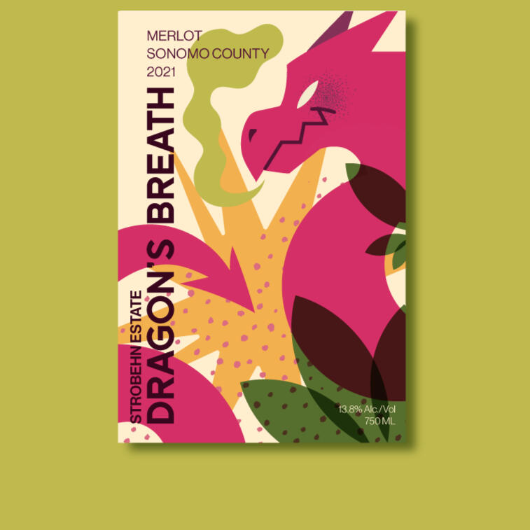
Wine Labels - Packaging
Blood Sugar - Packaging
Modi - Packaging
Mystilore - Identity
Yes I'm Changing - Poster
Space Utopia - Illustration
Fourth Wall - Publication
WalkPact - Campaign
Health Valley - Packaging
Color Block - Wayfinding

About the Artist ★
Hello! I'm Emily / Em! :)I'm a graphic designer and Illustrator!I specialize in illustrative design with a focus on aesthetics and graphics! I was a student at College of Dupage and am a recent graduate from Columbia College Chicago.☆ Winner of the COD Portfolio '23 & '24 Illustration category! ☆Art has always been a major part of my life. Even in my oldest memories, I have always felt a pull to illustration. Art, art, art is all I have ever known. When I was younger, whenever someone asked me what I wanted to be I always said 'artist' without a second thought.To me, there was no other option! I wanted to pursue what made me happy and that's exactly what I did. Graphic design to me is a perfect blend of artistic ability and having a purpose for creation. Design is art with purpose, a goal, and a mindset and to execute each project is like watching an idea come to life.

Aten - Movie Poster
The objective for this project was to utilize illustration to create up a fictional movie poster along with made-up characters and a plot and storyline that fits within that respective universe.Aten, the younger alien on the right, is an boy who is trying to stop his tyrannical father from taking over the other planets in the universe by any means necessary.


Types of Design - Identity
This project is to create a design system that was eventually simplified into showcasing the different types of graphic design through these two characters and symbols.The idea I wanted to pursue was showing the different types of design as unique weapons or concepts! Pencil sword, computer mouse shield, cardboard box armor, and finally a leader.☆ Winner of the COD Portfolio '24 Illustration category! ☆


Bat Stamps - Identity
The objective of the project was to create postage stamps and sheets with additional colorways.The design itself had to be created using traditional shapes, triangle, circle, square, diamonds, to convey the figure in its most basic form while still being recognizable.


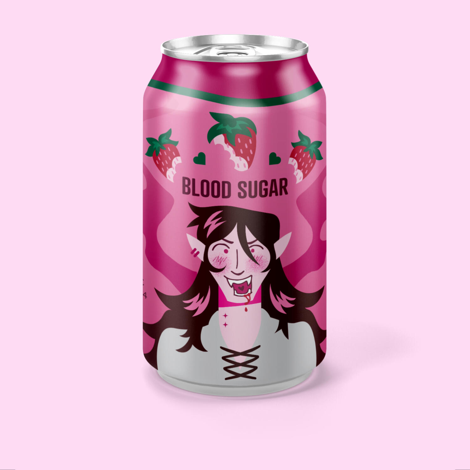
Blood Sugar - Packaging
Vampires. Who doesn't love 'em?
This project was to create a unique illustration for a metal can competition for Hart Print!I really love the idea of vampires and strawberries so I wanted to go the route of the vampires drinking the red from the strawberries (probably from all my years watching Adventure Time as a kid!)


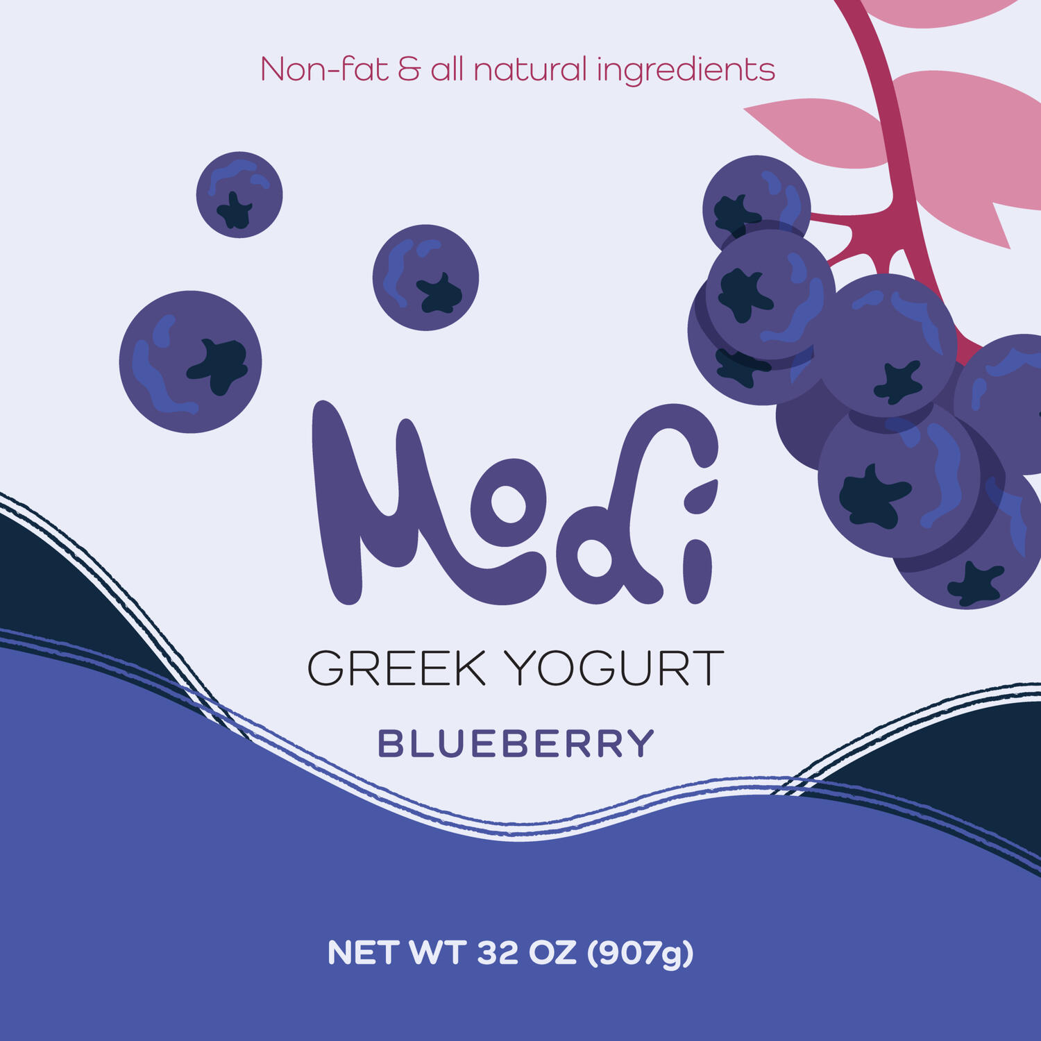
Modi - Packaging
Modi is a project with a pre-given name and genre (food, health, athletics) where you create a brand and decide on a product that you think best fits the naming scheme.Chosing Modi, I decided I wanted to create a healthy greek yogurt product and created three labels in three flavors of blueberry, strawberry, and peach! Personally I have always felt more invested in products with illustrations over photography and wanted to challenge myself with it!


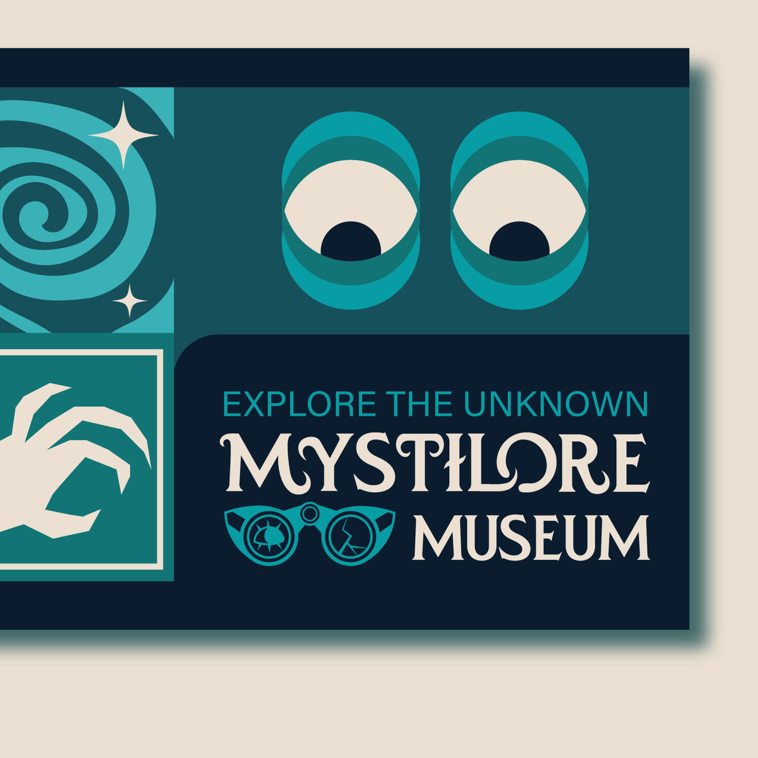
Mystilore Museum - Identity
Mystilore is a museum that focuses on the unknown aspects of the world such as the supernatural, folklore, conspiracy theories, cryptids, and other sources of horror and mystery stories.I have always been fascinated by the unexplained things in the world and I wanted to create a museum that could reflect on those tales and be able to bring to light the history and art based on these stories.


Fictional Pop-Up Shop
Later a pop-up shop addition was created for a fictional event where I included an X-Files theme to fit the museum's branding of the allure of the unknown and the mystery of it all!


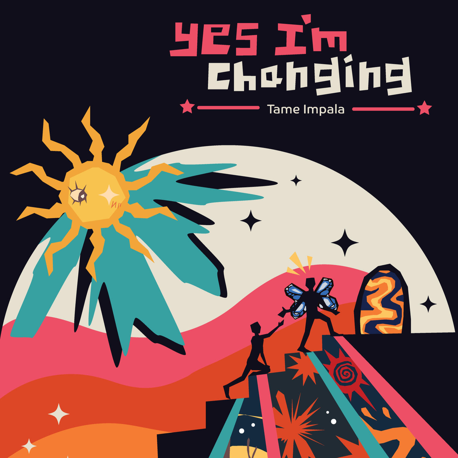
Yes I'm Changing - Poster
The objective of the project was to pick a song that resonated with you and to create and illustrate meaning through visual storytelling of the chosen song.I chose the song "Yes I'm Changing" by Tame Impala and illustrated imagery that had reminded me of the song while listening to represent the concept of transformation within a person and the progress one goes through to help reach personal end goals of self improvement.


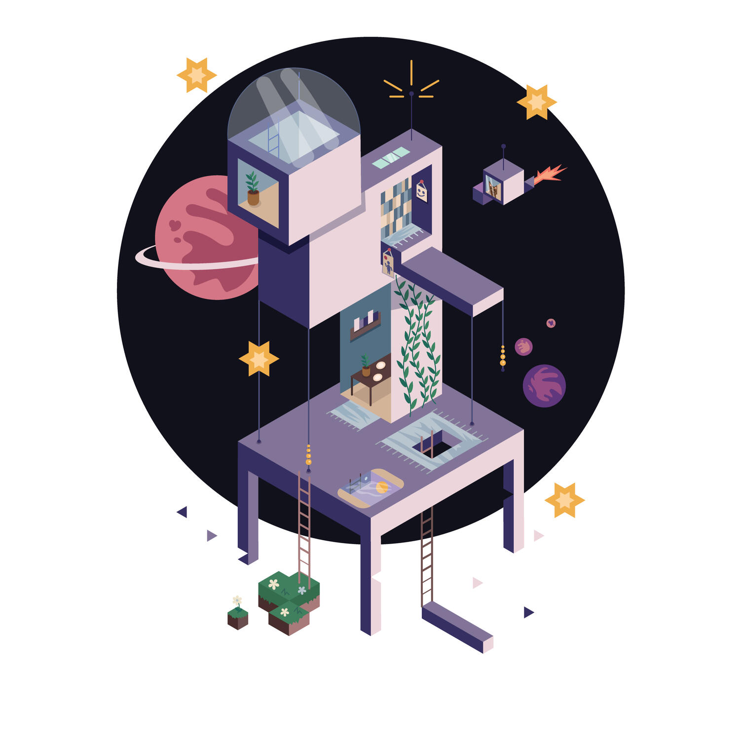
Space Utopia - Illustration
The objective of the project was to create an isometric illustration relating to the concept of one's own personal utopia.My personal utopia is related to the beauty and peacefulness of space. I am really fond of comfortable and simple architecture and living, so I wanted to incorporate that along with features that are not entirely practical to add charm to the buildings.☆ Winner of the COD Portfolio '23 Illustration category! ☆


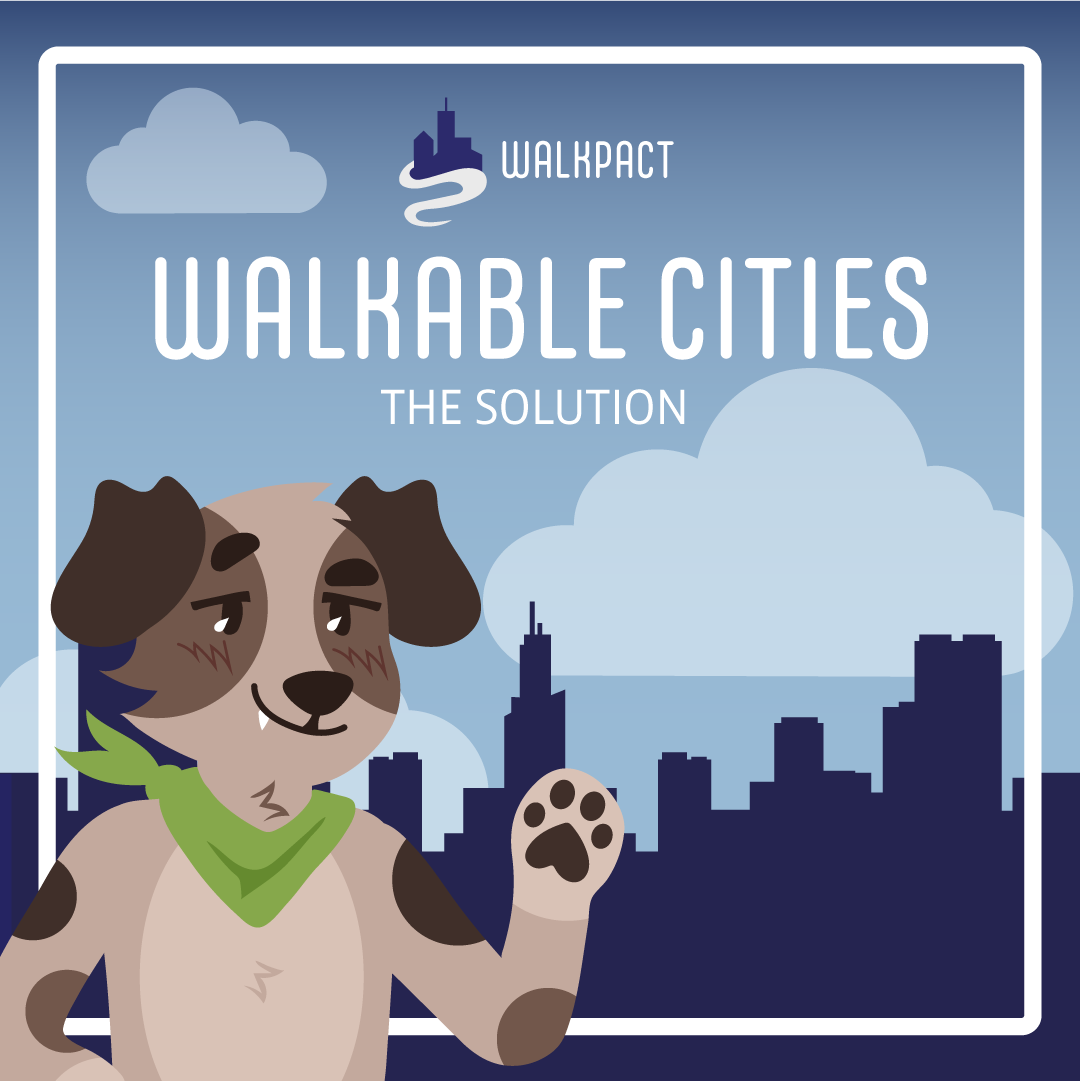
WalkPact - Campaign
For this project, we had to create a campaign and a logo, Instagram carousel to help spread awareness on a topic of our choice.WalkPact is a nonprofit group that aims to provide information to help people advocate for more walkable cities and for current cities that aren't just the major ones to become more walkable in an effort to improve the lives and health of our communities.


Punk Rocks - Packaging
Punk Rocks takes crystal bracelets in combination with alternative styled leather bracelets for a selection of fun accessories with elements from nature. I really wanted to push the illustrative aspect to stray away from the simplistic and feminine packaging trend for accessories


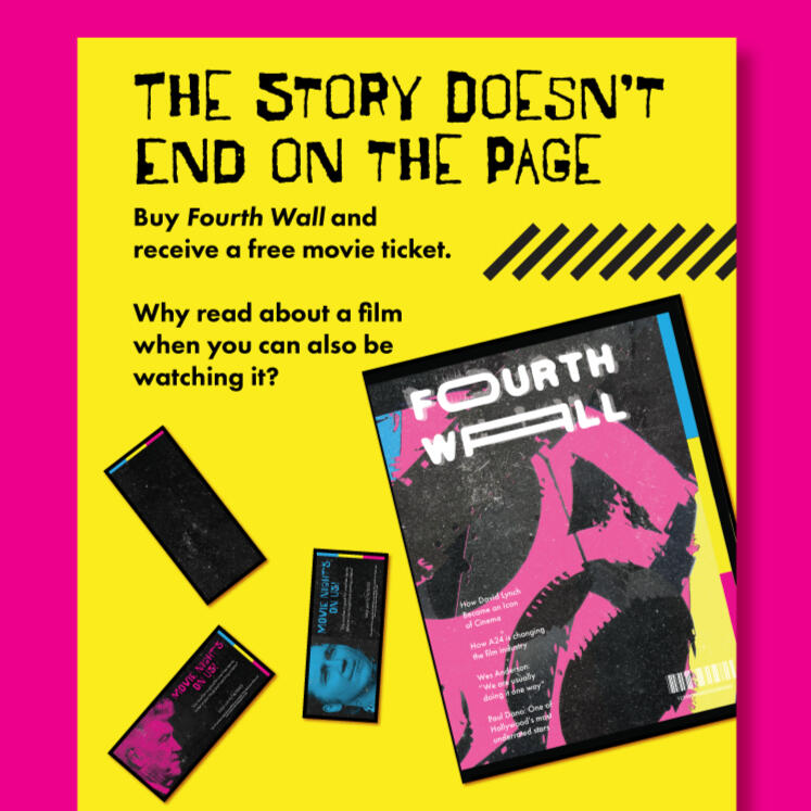
Fourth Wall - Magazine
Fourth Wall is a magazine publication project in which the main subject is about movies, actors, and all events surrounding the film and TV industry!I, of course, used this as a perfect opportunity to talk about my favorite actors and films in an effort to show the world my appreciation while also adhering to the taste at hand of advertising future and upcoming events as well within the industry.


Wine Bottles - Packaging
The objective of the project was to create three wine bottles under different demographics and prices. Starting at low range, to mid range, to high end! Each wine label had a different target audience and therefore a different design path that depended on each different type of audience.The wines in order are based on the following demographic:1. Casual, fun, sense of humor.
2. Contemporary, modern, leading edge.
3. Traditional, high quality, premium, expensive


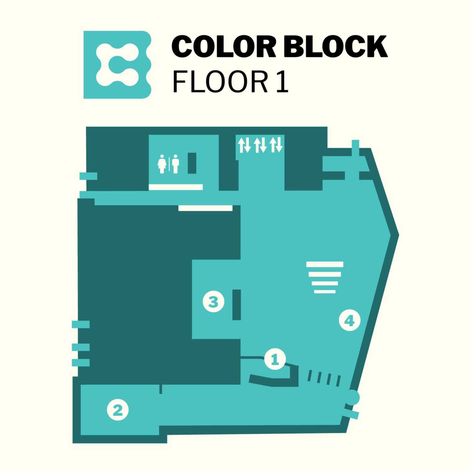
Student Center - Wayfinding
For this project, we had to pick a location to rebrand and to create wayfinding for. I picked my college's student center, as whenever I had visited the location I found the wayfinding extremely dull and lackluster for what was supposed to be the creative center for all students of all majors in an art school.While maintaining wayfinding standards for visibility and rules, I really wanted to embrace the colors of our school from the official brand guidelines and incorporated them for each floor of the building for easier accessibility for mapping.


Poster Format


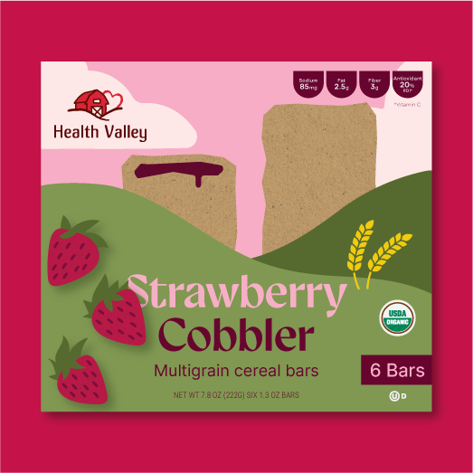
Health Valley - Packaging
The purpose of this class project was to pick a pre-existing brand after searching in stores and redesigning it based completely which includes logo and packaging.Health Valley is a brand owned by The Hain Celestial Group, Inc. They offer multigrain cereal bars in many flavors and are healthy snacks contain no trans fats, high fructose corn syrup, or artificial preservatives. For my rebrand, I redesigned their old cereal bar products and really wanted to embrace the warm, welcoming feeling to make the rebrand feel welcoming and rooted in nature.


